
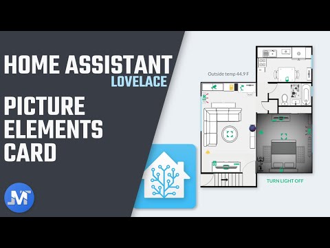
The Picture Elements card in Home assistant is one of the most flexible cards available for the Lovelace UI. Allowing to add icons, text, and services on different parts of an image. Today, I’m going to show you how to set up an image of a floor plan and add entities to that image using the Picture Elements card.
How to create a floor plan
There are a few apps out there that you can use to create a floor plan, but one that I highly recommend is called Magicplan. It’s straightforward to use, and it’s available on both IOSand Android. You can create a floor plan for free and export an image of that floor plan for just $3 which is pretty cheap for all the features that you get and also how easy it is to use. So I definitely recommend it.
Set floor plan as a panel in a View
Once you have an image of a floor plan, you need to save it in the www folder. If you don’t have this folder yet, you would need to create it inside the Home Assistant’s config folder. Then, open the lovelace.yaml file and set up a separate View for the floor plan. You also want to set up the View as a panel so like that the Picture Elements card displays in full width. Then, define the card type as a picture-elements and below, add the floor plan image using the path /local/ and then the name of the picture including the file extension.
- title: Floor plan
  panel: true
    cards:
      - type: picture-elements
        image: /local/Apartment_FP.png
        elements:
Below, you can now start adding all the elements that you want on top of the floor plan. There are several elements that you can use:
- state-badge
- state-label
- state-icon
- service-button
- icon
- image
The first one we’re going to look at is the state-badge which allows adding sensors to the image.
State-badge Element
Define the element type as state-badge. Then, for the entity enter the name of the sensor you want to display. Now, to specify the position of the elements on the image, you would need to use the style variable and set the values for the top and left variables. If you increase the percentage for the top, it positions the elements more towards the bottom, and the same thing goes for the left. If you increase the value, it moves the element to the right.
The style variable uses CSS so there are several things that you can change. For example, if you want to change the size of the font, you can change it using the variable font-size
- type: state-badge
  entity: sensor.dark_sky_temperature
  style:
    top: 12%
    left: 32%
    font-size: 17px
Save the changes to the file and refresh the Lovelace UI and you would now have a floor plan image in a full panel View with the new state-badge created. Now, when you click on the badge, it would open the more info pop-up for that specific entity.
There are no other variables available for the state-badge that you can add but, to add more functionality to a sensor entity, you could use the state-label.
State-label Element
With the state-label, you can add the same sensor entity and add some text either before or after the entity using the variables prefix and suffix. You can also use the variable tap_action and hold_action to either open the more info pop up, call a service or navigate to another View.
Here is an example of the same weather entity.

I set up the element type as a state-label. For the entity, I enter the same weather sensor. Then, I added some text to show before the entity using the prefix variable. The text is also enclosed within quotes " " so space could be added at the end to separate the text from the entity value. I also added the tap_action variable, and I set it to action: navigate and then below I used the navigation_path variable set to the View where I want to navigate to. Lastly, I used the style variable to set the position of the label, and I also change the font size.
- type: state-label
  entity: sensor.dark_sky_temperature
  prefix: "Outside Temp "
  tap_action:
    action: navigate
    navigation_path: /lovelace/2
  style:
    top: 22%
    left: 32%
    font-size: 20px
Now, the state-label show up with the entity data, and when clicked on, it’s going to navigate to the view that was specified
State-icon Element
Apart from the state-badge and the state-label, you also have the state-icon element which allows adding entity icons like switches and lights to see their current state. With the state_icon, you can also use the variables tap_action, hold_action, navigation_path, and service
Here is an example that I set up for my living room light.
I defined the element type a state-icon. For the entity, I added a switch that is connected to my lamp, and I also gave it a title, which it shows up when I hover over the icon. I set up the tap_action as action: toggle so like that when I click on it, it turns the light on and off.
- type: state-icon
  entity: switch.living_room_light
  title: Living room light
  tap_action:
    action: toggle
  style:
    top: 73%
    left: 18%
    --iron-icon-height: 42px
    --iron-icon-width: 42px
By default, the icons are a bit small, but you can make them bigger by adding the options --iron-icon-height and --icon-iron-width to the style variable.
Icon Element
Now there is also the icon element which works similar to the state-icon. The only difference is that it doesn’t show the state of an entity. It also has the same variables available with the addition of the icon variable to be able to define the icon that we want to display for the specific entity. Here is an example of how I use this element.
- type: icon
  title: Living room camera
  icon: mdi:cctv
  entity: camera.living_room_camera
  style:
    top: 30.5%
    left: 22%
    --iron-icon-fill-color: "#11AB7D"
    --iron-icon-height: 40px
    --iron-icon-width: 40px
I set up an icon element for my living room camera, and I defined the icon that I wanted to use for this entity. Then I added the variable --iron-icon-fill-color to match the color of the icon with my current theme.
Now, I didn’t add the tap_action variable because by default when you tap on the icon, it shows the more info pop up, but if you want to set something else, you can always set that variable like on this example where I set up and icon to navigate to another View.
- type: icon
  icon: mdi:fullscreen
  title: Living room Floor Plan
  tap_action:
    action: navigate
    navigation_path: /lovelace/3
  style:
    top: 61.5%
    left: 32.5%
    --iron-icon-fill-color: "#11AB7D"
    --iron-icon-height: 60px
    --iron-icon-width: 60px
Service-button Element
All right, so those were the state elements available, plus the icon element. Now let’s take a look at the service-button which allows adding a button to call a service. A perfect example for this would be to create a master button that would turn all your lights off at the same time. Let me show you an example.

- type: service-button
  title: Turn lights off
  service: homeassistant.turn_off
  service_data:
    entity_id: group.all_lights
  style:
    top: 93%
    left: 65%
After you defined the element type as a service-button, add a title that would be the label for the button. The service set it to homeassistant.turn_off. Then, set the variable service_data with the entity_id group.all_lights
If you are like me and have some light entities and also some smart switches connected to lamps, then you can create a script to group all the lights together and then add the script name to the service variable.
#### Turn off all lights - Script ####

turn_off_lights:
  alias: Turn lights off
  sequence:
    - service: switch.turn_off
      data:
        entity_id: switch.living_room_light
    - service: switch.turn_off
      data:
        entity_id: switch.bedroom_light
    - service: light.turn_off
      data:
        entity_id: light.desk_light
#### Service button for script ####

- type: service-button
  title: Turn lights off
  service: script.turn_off_lights
  style:
    top: 93%
    left: 65%
Now, anytime you want to turn off all your lights at once, instead of tapping on each individually light, you can use this service-button to do it quickly. So, it’s definitely, an essential element to set up on your floor plan. Especially if you have many lights in your home.
Image Element
All right, last but not least, let’s take a look at the image element which allows adding additional images on top of the main picture. It’s convenient because you can create some cool effects like for example making a room on a floor plan look darker when the light is off and then brighter when the light is turned on.
You also have access to the variables that we’ve used on the previous elements with the addition of the variables image, camera_image, state_image, filter, and state_filter
Example 1
For example, to make the rooms look darker when the lights are off, you would first need to make a copy of the floor plan and crop the image to just the room that you need. After that, save the image in the www folder. Then, in the Lovelace file, define the element type as an image, set up the light entity for that room. Then, add the tap_action variable and if you want to tap anywhere on the image to turn the light on and off, then set it to toggle. Otherwise, set it to none if you are using a state-icon to toggle the light.
After that, add the variable image and add the path for the new cropped image. Then, using the variable state_filter set the brightness for the on and off state of the light entity. Now position the image using the style variable and also add the width to specify the size of the image.
- type: image
  entity: switch.living_room_light
  tap_action:
    action: none
  image: /local/Living_room_FP.png
  state_filter:
    "on": brightness(100%)
    "off": brightness(50%)
    style:
      top: 57.2%
      left: 31.8%
      width: 64.4%
Now, anytime that you turn the light on and off, the specific room in the floor plan would change between a normal image and a darker image.

Example 2
Another way that we can set up this same example is by using 2 cropped images for a room. One with normal brightness and the other one that would be darker. Alternatively, you can do like me and set up a vignette to give it a better look when the light is off. Then instead of using the filter and the state_filter variables, you can use the state_imageand set up the 2 images on the on and off state.
- type: image
  entity: switch.living_room_light
  tap_action:
    action: none
  image: /local/Living_room_FP.png
  state_image:
    "on": /local/Living_room_FP.png
    "off": /local/Living_room_FP_off.png
  style:
    top: 57.2%
    left: 31.8%
    width: 64.4%
All right, so there are a lot more ways that you can use the Picture Elements card and make it work better on your setup. I hope that this walk-through of the available elements can help you accomplish that.
On future articles/videos, I also want to go over some of the available custom cards for Lovelace. I already have a few in mind that I’m going to cover, but I would like to get some more feedback so let me know if you can via twitter or in the video description above.
WANT TO SUPPORT JUANMTECH?
You can do so now on Patreon and Buy Me A Coffee